In numerous sixteenth- and seventeenth-century oil paintings rich Netherlandish merchants and other important burgers are portrayed wearing luxurious black fabrics and white lace. Both textiles, as well as the garments depicted in the portraits, represent a remarkably broad range of black tones. Although these fabrics, real or depicted, are all of a single colour, black, they are designed, woven, or adorned in such a way to create contrast and sheen as well as depth of shade in black-on-black. Undoubtedly this style must have been quite a challenge, not only for dyers and textile manufacturers but also for painters. In black fabrics, this tonal variation was achieved through a choice of specific dyes and often complex dyeing techniques. Painters, on the other hand, would select from a range of black pigments, some a cool hue, others a warm tone. They could add even more variation by adding small amounts of colour and by employing specific paint-layer build-ups to render the characteristics of velvet, satin, wool, and other black fabrics.
Very little black clothing or textile has survived in Dutch and Flemish collections from the Burgundian period. This is partly due to the fragile nature of textiles — silk in particular — but also to the fact that the Dutch monarchy only started in 1815 when black was no longer the most fashionable colour. As a result, there is no royal collection in the Netherlands predating 1815, apart from a few objects related to important predecessors of the royal family and important figures of state. On top of that, in some cases the textiles, especially silks, deteriorated rapidly, not only as a result of the fragility of this material, but also due to the dyeing process. Although the rules for dyeing wool in the Netherlands under Burgundian-Habsburg reign up to the seventeenth century were very strict, for silk they were much less so. In the production of high-quality wool for clothing, the dyeing process was one of the most important and expensive parts.[1] In many cases the use of corrosive mordants was allowed, which means even fewer black silks from this period survived.[2]
Black textiles in the Collection of the Rijksmuseum Amsterdam with Suzan Meijer and Art Proaño Gaibor, Atelier Building Amsterdam. A film by Katrien Vanagt and Stefano Bertacchini, 2019. @Katrien Vanagt for Artechne
Without many textile samples, we are left to turn to painting to envision Burgundian blacks, but black garments in paintings often appear to lack the tonal nuance and detail described above. This limitation may be due to darkening of binding media over time, or to past cleaning treatments causing damage to the subtle black transparent glazes used to create depth of tone and render the nature of the fabric. However, many excellent examples remain, demonstrating the painter’s skill in depicting what is often considered an elusive or auxiliary colour on the painter’s palette.
Reworking black oil paint with Erma Hermens, Atelier Building Amsterdam. A film by Katrien Vanagt and Stefano Bertacchini, 2019. @Katrien Vanagt for Artechne
In this chapter we present some rare sixteenth- and seventeenth-century textile objects from the collection of the Rijksmuseum, Amsterdam; we discuss their materials, techniques and, in some cases, the results of dye analysis.[3] This discussion will be followed by a study of recipes for the manufacturing of black pigments for oil painting and the way these pigments were used to convincingly render different types of fabric, tone, and detail in black garments. Two case studies of sixteenth-century Netherlandish portraits from 1518 and c. 1560–1565 will allow a close examination of the materials and techniques used.
Analyzing black oil paint with Erma Hermens, Atelier Building Amsterdam. A film by Katrien Vanagt and Stefano Bertacchini, 2019. @Katrien Vanagt for Artechne.
Black on Black: A Challenge for Dyers and Weavers
There are several ways to create contrast and depth when working with black textile. Most of these depend on the three-dimensional structure of the textile. In general, fulled woolen textiles (if not pressed), such as worsted (laken), will have a rather dull surface, and silk satin will look particularly shiny. However, although the sheen of the material itself plays a role, the spinning and weaving of the materials is of no less importance.
Many early modern recipes dating from the fifteenth, sixteenth, and seventeenth centuries for dyeing wool, silk, and linen came down to us in miscellaneous recipe collections and dyer’s manuals in print and manuscript.[4] Depending on the type of fabric, ingredients and technologies for black dyeing can (slightly) differ. However, none of the black dye recipes we have found so far give instructions for attaining different shades of blacks to create depth in a specific textile. They also do not mention the required variations in three-dimensional structure within a textile to show off the richness of these black clothes. Nonetheless, the surviving objects testify to the knowledge artisans had, and they attest to the ability to attain various shades in textiles; apparently much of this knowledge was kept secret and transmitted orally, because it is absent from historical recipes.[5]
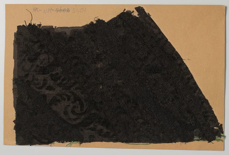
A Worsted Doublet with Silk Embroidery
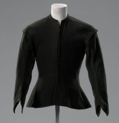
and decorated with silk embroidery, h ca. 60 cm, Netherlands,
1680-1688, Rijksmuseum, BK-NM-5573.
https://hdl.handle.net/10934/RM0001.COLLECT.330996
We can see the importance of materials in the production of colour effects when we study a doublet in the Rijksmuseum’s collection, dating from 1653–1672, made using worsted (laken) and decorated with silk (BK-NM- 5573) [Figure 1]. Although this type of garment is typical for the last decade of the seventeenth century, on the island of Marken it was worn well into the nineteenth century as part of their traditional costume.[6] Dating the sample is difficult, then, as shape and construction were unchanged over the course of centuries, and so we needed to analyze the textiles themselves to learn how and when they were made.
Worsted is a type of woolen fabric with a plain weave, which is later fulled (a process which makes the surface of the fabric slightly felted).[7] The weaving of these materials was carried out by several highly specialized professionals. After weaving, the material was dyed and fulled to make the fabric thicker, warmer, stronger, and more water resistant.[8] This fulling of fabric involved applying urine or fullers earth to the fabric and rubbing it into the material by beating or treading. After this process, the material was washed and carded so that the hairs on the surface of the fabric would lie to one side, giving it a ‘rich’ and slightly shiny texture. Only the best and most expensive wool yarn was dyed before weaving; most frequently, the woven fabric was dyed as a piece. [9] As the wool for this doublet was dyed through and through, which is harder to achieve in a woven piece of cloth than in the woolen threads before weaving, it seems that the best quality of woolen fabric was used. [10]
In the early seventeenth century, dyers were not allowed to use gallnuts in combination with iron mordant when dyeing wool, but were obliged to dye red over blue, i.e., madder (Rubia tinctorum) over wool dyed blue with indigo (Indigofera tinctoria), or woad (Isatis tinctorial).[11] During the Late Middle ages dyeing red (madder) over dark blue (woad or woad/indigo) was apparently the most costly and durable method to dye black in the Burgundian Netherlands.[12]
Later in the seventeenth century the rules were changed; Dutch dyers were allowed to use other dyestuffs and methods, including the use of galls, sumac, alder bark, and even iron mordant.[13] The wool for this doublet was dyed using indigo, then madder (with an alum mordant), and sumac (in combination with iron sulphate).[14] This method of dyeing was used in Leiden and other parts of the Netherlands between 1653 and 1672 and was considered to be the best quality. [15] A handwritten recipe for ‘woded blacks’ that mentions these ingredients, was found in an early seventeenth-century apothecary’s recipe book, in the Bodleian Library, Oxford.[16]
The rules for dyeing silk, however, were already less strict from the fourteenth century onwards. The silk used as embroidery on the shoulder flaps and buttonholes of the doublet was originally shiny, but it probably also had a slightly different tone [Figure 2]. This change in tone is partially caused by the use of silk instead of wool, but the material is also coloured with a different dye technology using galls and metal salts, resulting in different black hues.[17] Unfortunately, it is likely that this dyeing process also caused the progressive deterioration of the silk thread.

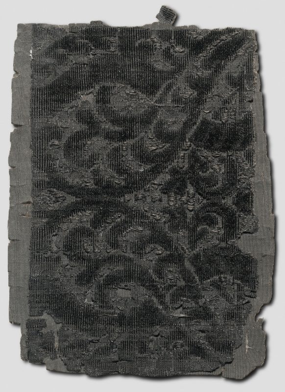
A Fragment of Silk Damask
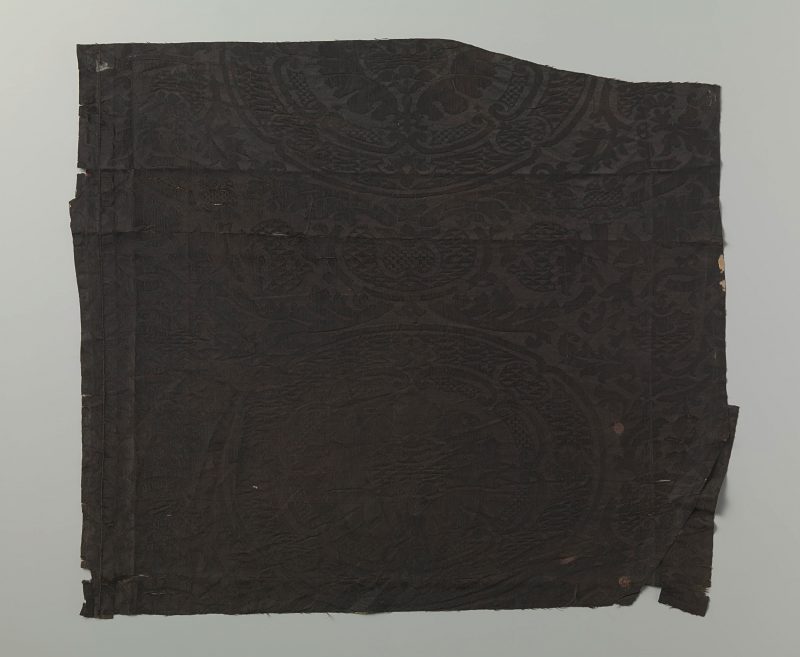
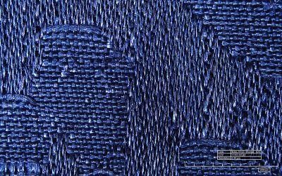
Contrast within a single piece of black can also be achieved through the weaving technique. Damask, for instance, is a type of fabric in satin weave, in which the pattern is created by alternating the floats in warp and weft, meaning that the floats create a shiny surface [Figure 3].[18] This fragment of silk damask (BK-NM-3619) dating from the sixteenth century is a good example. Like most damasks, it shows a pattern in warp-faced satin weave with a ground in weft-faced satin.[19] As a result, the pattern looks light and shiny against a darker, matte background. On the reverse the pattern looks dark and matte against a lighter shiny background. Although the effect creates two different tones of black, in reality only one dye is used for both warp and weft. The effect is solely created by the reflection of light as a result of the structure of the weave and there is no difference in thickness, dye used, or structure between warp and weft. A close-up image of this technique clearly shows the distinction between the motif and the background [Figure 4].
Dye analysis of the fragment revealed the textile was dyed using kermes (the dye was extracted from the dried scale bodies of the female insect Kermes vermilio P.), tannins, indigo (from woad, Isatis tinctoria), as well as yellow components (from weld, Reseda luteola). Kermes was derived from Southern Europe and the near Middle East, the latter imported — as Jo Kirby describes in her contribution to this volume — via Italy and Spain, and was mainly used to dye very expensive textiles a rich red colour.[20] The fact that it is used in the dyeing process for this damask may mean that the fabric or at least the materials it was dyed with originated from Italy or Spain.
Another way to create depth in black fabrics is to use one or more extra warp sets and thin metal rods to create loops which are cut to form a pile or are left uncut. Often a combination of both was used, as is the case for our fragment. This technique produces a textile called voided ciselé velvet, which means that there are areas of the ground weave free of pile, areas with an uncut pile, and areas with cut pile. The ground is a plain weave with a huge difference in thickness between warp and weft, creating a ribbed effect. The cut piled areas look darker than the background because they absorb more light, while the uncut piled areas can be distinguished because they reflect light differently. Weaving this type of velvet was an extremely time consuming, and therefore costly, process.
Hugo de Groot’s Cloak
Among the oldest fragments of a black fabric preserved in the Rijksmuseum collection are four pieces of a cloak, doublet, and breeches that once belonged to Hugo de Groot, the Dutch writer and politician (1583–1645) [Figures 5–9]. In July 1820 these clothes were cut into smaller pieces by a descendant, Hugo Cornets de Groot, and distributed amongst family and other acquaintances, accompanied by a handwritten certificate with wax seals declaring the authenticity of the pieces. Several fragments are now held in Dutch collections.[21]

Rijksmuseum, BK-NM-12233. https://hdl.handle.net/10934/RM0001.COLLECT.1809
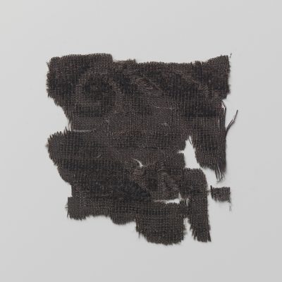
The silk fabric is a kaffa, the term used in the Netherlands for patterned silk velvets in the late sixteenth and seventeenth centuries.[22] It has a distinct white-and-green striped warp chevron twill selvedge and therefore we know that the warp and weft materials were definitely dyed before weaving [Figure 10]. Although the motif of this fabric is mostly characteristic for early seventeenth-century Italian fabrics (which were also available in the Netherlands during the sixteenth and seventeenth centuries) it is possible that this velvet was actually woven in the Netherlands.[23] Dye analysis revealed that not only the weaving was very complex, but the dyeing process was no less so. A different method was used for warp, weft, and supplementary weft, as well as for the pile, which means we witness four different dyeing methods in one textile, not including the lace. The weft was dyed in a black shade with a relatively simple process using a blue dye and a mordant.[24] The binding warp, however, was dyed ‘kastoor black,’ a dyeing process with blue (woad or indigo), tannins, and a red insect dye.[25] In this case the process was followed by a yellow dye bath to deepen the colour further. The pile was dyed with yet another recipe, including a high concentrations of tannins, indigo, and madder as well as weld. This part of the textile has the most of tannins. The floating warp threads are dyed using indigo and tannins, which resulted in a still visible blue-greyish tone. The lace strips on the velvet fragment are dyed using blue and tannin, which was a common recipe in the mid-seventeenth century and suggests that the lace is of a later date than the velvet.[26]. The motif also indicates a mid-seventeenth century date, making it likely that the set of clothes was made towards the end of de Groot’s life, reusing a velvet from the 1620s combined with a modern lace from the 1640s.

Of course the textile is now almost 400 years old and some of the dyes have deteriorated more than others, hence the original appearance of the fabric is hard to determine. However, the use of so many differently dyed materials in one object must been done with specific and elaborate intent.
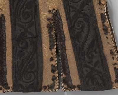
Leather Gloves with Embroidered Silk Decorations

Apart from the use of different weaving methods, embroidery also played a major role in creating three dimensionality in textiles. For example, the cuffs of these leather gloves dating from 1600–1625 (BK-KOG-19 a/b) are decorated with silk satin strips, embroidered with two types of laid cord [Figure 11]. In this case the embroidery stands out from the background as it is less shiny and has a three-dimensional structure that absorbs more light than it reflects, making the embroidery thread looks darker than the background [Figure 12].
The fringe that adorns the edge of the cuffs was originally much longer, but as a result of deterioration, most of it is now lost. However, the original idea must have been something like fur or feathers. Analysis shows that different dyeing processes were used for the satin, the embroidery threads, and the fringe.[27] The satin was dyed using a lot of indigo and tannins (the ‘jet black’ recipe for wool again) and the fringe by using woad, tannins, and cochineal (insect, Dactylopius coccus). The most expensive dyeing process — combining blue (indigo), red (kermes), and yellow (weld) dyes — is found in the embroidery thread. As in the damask, the presence of kermes as the red dye makes an Italian or Spanish origin very likely.
A Black Bobbin-Lace Cap
Sometimes black lace was used to adorn garments, and many examples can be found especially on portraits dated between 1620 and c. 1680, such as in this Portrait of Geertruida den Dubbelde, by Bartholomeus van der Helst from 1668 (oil on canvas, 139 x 125 cm, Netherlands, Rijksmuseum, SK-A-141; Figure 13). [28] Black silk lace was produced in Genoa and Ile-de-France, as well as Flanders.[29] Actual silk laces dating from the seventeenth century, however, are extremely rare.[30] Beside the two lace strips on the velvet fragments [Figures 5 and 7], there are only two other examples in the Rijksmuseum collection of which one is possibly a cap (tipmuts, BK-18836; Figure 14), the other a narrow strip (BK-NM-VI-R; Figure 15). Both are bobbin lace, made using a large number of small wooden or ivory bobbins that hold threads that are intertwined to form a pattern.

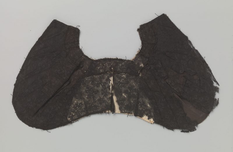
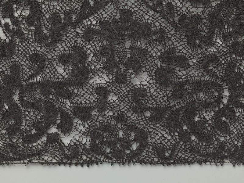
The cap is constructed of no less than five separate strips of seventeenth-century lace that were re-used at an unknown date.[31] The widest of these strips is probably the most valuable and is relatively similar to BK-NM-VI-R. Dye analysis showed that all of the lace strips in the cap, as well as the other narrow strip, were dyed using a combination of tannins and iron filings or grindings. This is not at all surprising as it was a commonly used dyeing method for black silk in the sixteenth and seventeenth centuries, not least because it was a process that easily produces a very deep black colour.[32] Sadly, as we see in this case, the use of this dye method has likely led to severe loss of fibres and deterioration of the silk lace.
Painting Black
Analysis of both the textiles’ structures and the dyes used in the objects described above demonstrates that the possibilities for varying the hue of black dyes as well as the fabrics’ weaves — and hence the grades of sheen and depth of colour — are almost endless. It also seems that specific dyes and dyeing methods were systematically used for different fabrics and yarns. Black textiles for garments to be worn by the higher echelons of Burgundian society, which had to show wealth and splendour, could be made in so many ways that both the weavers’ and the dyers’ knowledge of the complex system of combining dyestuffs, mordants, and weaves was instrumental when hoping to achieve the finest results.
A similar approach was necessary for painters who had to capture the likeness, as well as the status, of the rich and famous in their portraits, often expressed through their choice of fashionable black garments. Undoubtedly, painters had their own difficulties in accurately representing these fabrics. They needed to fully employ the characteristics of the black pigments available and use ingenious painting techniques to render silk, satin, wool, and velvet adequately.
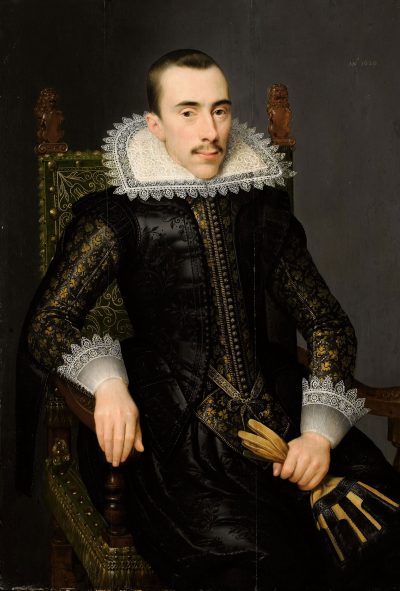
A fascinating link between textiles and paint can be made here through the gloves adorned with lace ribbons and embroidery discussed above. A very similar pair are depicted in a portrait of a man, probably Walterus Fourmenois (1596–1653), attributed to Salomon Mesdach (1620, oil on panel, 104 x 72.1 cm, Rijksmuseum, SK-A-911; Figure 16). Fourmenois was a member of the Boudaen Courten family from Middelburg, the Netherlands, descendants from Guillaume Courten, a textile merchant from Menen in Flanders, who owned a lucrative business in London with branches in Cologne, Hamburg and Middelburg amongst others.[33] Walterus was the brother of Catherina Fourmenois who married Pieter Boudaen Courten, Guillaume’s son.
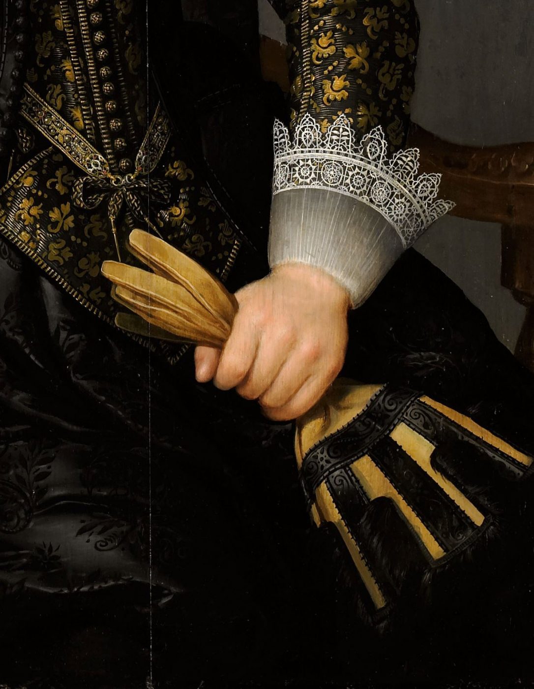
In this magnificent portrait, Fourmenois wears garments from various black fabrics, holding the now familiar pair of gloves. As was observed, the fringe passement that adorned the edge of the cuffs is lost in the leather gloves, but must have been made from a material very much like fur or feathers, as can be seen in the portrait. Although no direct connection between the provenance of the painting and the gloves was found so far, sitters tended to wear and carry their most prized, fashionable, and luxurious accessories when portrayed. As the Boudaen Courten family belonged to the wealthy mercantile class, it is unlikely that the depicted gloves were not a personal accessory of the sitter and they may therefore very well be the same as the real but damaged leather gloves.[34] In the portrait, both the rich fabric of Fourmenois’s costume and the decorations of the gloves show the characteristic sheen of a silk satin, embroidered in black. The cool tone of the black satin stands out beautifully against the golden yellows in the sleeves and the whites of the cuffs and collar. In the decoration of the gloves, the deep black matte embroidery contrasts with the shiny black satin ribbons, rendering the two different types of materials perfectly [Figure 17, detail].
Mesdach also portrayed the young Pieter Courten [Figure 18]. He is dressed following the latest fashion and holds quite similar gloves albeit differently decorated. His costume shows an interesting combination of dark grey, purplish and deep blacks.[35]

on canvas, 192 x 106.5 cm, Rijksmuseum, SK-A-913.
https://hdl.handle.net/10934/RM0001.COLLECT.9077

The Palette for Black
The great variety in black dye recipes compares with the broad range of black pigments available to painters. Black is not just black; indeed, painters could choose from many blacks and were praised for their technical skill when they were able to depict the tonal and textural variety of the various black fabrics. Giorgio Vasari, for instance, describes in his Lives of the Artists (1586) how Sebastiano del Piombo (1485–1547) used at least five or six blacks in his portrait of Pietro Aretino to paint the velvet, satin, ormuzine, and damask fabrics of Aretino’s garments, and how the deepest black was left for Aretino’s beard. Vasari praises Del Piombo not just for the likeness of the portrait but above all for the distinction he achieved between the black tones.[36] Del Piombo and his contemporaries could select many black pigments, such as ivory and bone black, charcoal black, lamp black, fruit stone black, black earth, and many more charred, carbonised materials, as listed in contemporary art technological texts and price lists for pigments.[37]
Edward Norgate (1581–1650), a renowned courtier, herald, and miniaturist in service of the English king Charles I, in his treatise (1627-1628) Miniatura, or the Art of Limning, presents a range of black pigments. ‘Lampblack, Cheristone black, Ivory black’ appear in his list of pigments suitable for the limner’s palette.[38] In addition, in instructions on how to make various blacks for use in ‘oyle,’ Norgate lists ‘ivory black, lamp black … harts horn black … charcole black … sea cole black’, the final of which is most likely common coal.[39] Spring et al. identified several types of black coal and black earths pigments in Italian paintings, many of which are also mentioned by Norgate.[40] Parsing these types of black, he specifically describes ‘Black earth that the Paynters that Paynt Mapps and Coper plates use,’ which, he states, is far better than Lamp Black. The term ‘black earth’ is rather ambiguous and used for a range of black drawing materials and pigments. For example, a black earth derived from the casting of bells is mentioned in the Mariani-Cibo manuscript, an Italian text on miniature painting dating from 1620, where it is recommended as an alternative to black earth. In the detailed descriptions on pigment manufacturing, the chapter on Black Earths explains how ‘These blacks are all made from burnt matter just like the black earth, which is very dry and burnt by nature. As experience shows, in the casting of bells, while the metal falls in the earthen mould, it causes a large part of it nearest to the metal to become very black. The painters use this instead of black earth’.[41]
A late sixteenth-century French manuscript, kept in the National Library of France, Paris (BnF Ms. Fr. 640) provides a remarkable insight into Renaissance artisanal crafts and colour-making techniques, and contains various entries concerned with black pigments and dyes. For many of them the author describes his own trials and experiments.[42] For example, on fol. 58v he lists materials for making black pigments: ‘Black of charcoal from the mines, of ordinary charcoal, of burnt ivory, of peach pits, of lamp smoke, of burnt bones of the feet of oxen’.[43]
Extensive descriptions of the manufacturing of black pigments can be found in the De Mayerne manuscript as well. Theodore Turquet De Mayerne (1573–1655) was a physician at the English court, who maintained contacts with many artists and artisans working for the king or visiting the court, some from Flanders. Artists’ names mentioned in the manuscript seem to derive from these encounters.[44] De Mayerne’s recipe collection comprises a list of ‘common colours for oil’ (fol. 6r) that mentions coal black of a very soft type, which should be ground with water before mixing it with oil. The list also includes a description for making oil paint from lamp black, but, as the recipe states, ‘the deepest black is made with ivory, burnt in an iron vessel well sealed with lut[um] [clay] & salt. This black has little body, & is to be applied over another lamp black as a glaze, which then gives an extremely deep black’.[45]
On 18 September 1629 De Mayerne recorded the advice of Daniël Mijtens, known in England as Daniel Mytens the Elder (c.1590–1647/48), ‘a very excellent painter’ from the Low Countries, who worked at the English court in London from c.1618 until 1634. This Dutch portrait painter apparently shared his knowledge on making black pigments for oil painting with the physician. Under the heading Labeur de noir (‘work in black’) De Mayerne notes on fol. 93r:
The best of all blacks, that spreads the best & the very same with which one can glaze, is the black from ivory, or from the feet bones of sheep. These are put in pieces in a crucible, it is necessary to cover it well with a tile or brick, & seal the junctions so precisely that nothing breathes. The whole is put in a good fire, only about an hour, otherwise the bones might turn white & so the material is burned to a perfect black.[46]
In the margins, De Mayerne added in red ink that a black from burnt antlers, ground with water, looks brown at first but mixed with oil becomes a ‘very beautiful black like jet’.[47] In general, Mayerne notes that ‘good and excellent black should be made of a bony white substance, extremely dense’ like the above mentioned ivory and sheeps’ feet bones. He also recommends ‘the teeth of a horse, a cow, dog, boar, Rosart . . . the petrosal bones of a calf & a horse. All burnt in a carefully sealed vessel’ (fo. 97r).[48]
Black Hues
As Del Piombo already demonstrated, painters knew how to make use of the different tones of the various black pigments, and hence their suitability for the depiction of dark shadows, or indeed black fabrics, was well known and appropriately applied. For the making of ‘Shadows’, the author-practitioner, in BnF Ms. Fr. 640, fo . 65r, explains this succinctly: ‘Because blacks appear in different hues, some reddish black, others tending towards blue, and others towards green, choose those tending towards yellow in order to obtain beautiful shadows in oil’.[49]
Similar advice on hue can be found in other treatises. Among the few pigments oil painters need to mix ‘all the other colours from’, De Mayerne lists black earth or black chalk which, as he explains, ‘dries easily, is fat, & spreads very well, & is more suitable than common charcoal out of which one makes the Blue black or Black blue to paint satin and similar things’ (fol. 4r). In the margin, De Mayerne added that ‘Coal black or black earth from Scotland / charcoal black from small vine twigs is blueish’.[50] In BnF Ms. Fr. 640, in the recipe for the painting of armour, charcoal black is especially recommended for its bluish tone: ‘Charcoal black mixed with a little lead white is very appropriate to make armour, mixing in a little of [illegible] azure if you wish. Charcoal black by itself is as if bluish’.[51] Furthermore, De Mayerne recorded precise instructions for using lamp black; we are warned that it spoils in oil and turns yellow if it is not burnt, but ‘burnt & mixed with white lead [it] produces a beautiful blueish grey almost like Indico’ (fol. 92v).[52] Norgate similarly explains how sea cole ‘makes a Red Blacke’, and, in the second edition of his treatise, sea coal is listed under the brown pigments.[53] This array of black hues is particularly useful for the realistic portrayal of silks, satins, velvets, and wool used in sixteenth- and early seventeenth-century fashion.
Painting Fabrics
Painters used different pigment mixtures and build-up of paint layers to render the great variety of texture and sheen, and also to indicate the weight of black fabrics, as heavy wool and velvet or the more delicate silk and taffeta would drape the human body in quite different ways. Karel van Mander in his Schilderboeck (1604) describes how each fabric coming from the weaver’s loom makes different types of folds depending on its ‘aerdt‘ — its nature.[54] Thick, stiffer fabrics have less drape than thin, heavier fabrics. Van Mander describes, for example, lijnwaad as a rather stiff linen, and its folds as ‘square’ with sharp angles.[55] The author of BnF Ms. Fr. 640 also emphasises the drape of a fabric and points at the importance of likeness when depicting it: ‘Folds in clothing. In this, one needs to take care that none are made false, but that only that which the natural can do is imitated. A thick cloth hardly makes any folds, taffetas & silk cloth make more, & crêpe more still. Make Heed which ones should go lengthwise & others across’.[56]
There are many surviving drapery studies that show how painters examined the drape and other characteristics of fabrics and garments. Such sketches address how the fabric clings to the human body or holds itself away from it. They also look at the placement of shadows and lighting, which together with the drape, would differ for velvets, satins, linens, and wool. Again the author of the French text provides us with some sound advice on painting velvet, emphasising how its characteristic highlights are set against the folds. At the same time, he points at the various tones of different blacks for shadows in blue, green, and red velvets and the pigments to use:
One needs [needs] to make the middle main layer very dark, & its folds & highlights very bright with white, & on the edges of its light, you make a white line. For blue & green velvets, you highlight touch the shading with peach pit black, which is very black. For lake, black of pit coal which makes a reddish black on lake for velvets. The common charcoal makes a whitish black.[57]
Variations in hue could also be obtained by adding small amounts of other pigments. Norgate, for instance, gives detailed instructions for rendering a variety of fabrics in ‘oyle.’ He explains: ‘For Black velvett. Take lamp black and verdegreese [verdigris] for the first ground. When that is drye, take Ivory Blacke and verdegreese; shadow it with a little whyte lead mixed with Lamp Black’.[58] On satin, he advises to add some lead white and red lake to create the characteristic sheen: ‘Satyns. For black sattjn. Take lamp Black and Grind it with oyle and then Temper it with whyte lead and where you will have it to shyne most mixe a little lake with the whyte lead’. [59] For the highlights and lit parts he suggests to add some indico: ‘For black as satin or the like, you may observe the same order for a middle colour, deepening with ivory black, and for the heightening, or light reflexion you may break your black with a little indico and white, you will find your blacks to render a very excellent reflexion’.[60] Norgate also refers to the portrait miniature painter Nicholas Hilliard’s use of ivory black as ‘a velvet black, and much used by M’ Hillyard ; the other makes good satin mixt with a little white, some Indicoe, and strongly deepned and heightned, to expresse the reflexions and lights’; he also hints at the use of models explaining that ‘the Life must be your Best derection’. [61] In a similar vain, De Mayerne suggests adding small amounts of verdigris and umber for black drapery: ‘lamp black, a little umber, a little white. Shade with ivory black, with mixed with verdigris. Heighten with lamp black mixed with white and a little umber’ (MS Sloane 2052, fol. 88v).
Similar mixtures, albeit in different order of application, are used for black satin and velvet, both starting with ivory black:
Black drapery. Lamp black, a little umber, a little white. Shadow it with ivory black mixed with verdigris. Heighten with lamp black mixed with white and a little umber. […] Black satin. Apply the first layer with ivory black & a little lamp black to make it greasy without forgetting the verdigris, then heighten it with white and lamp black & as much as a little umber […] Black velvet all with ivory black mixed with Verdigris, heightened with lamp black, lead white, & umber just a little for drying (fol. 88r).
De Mayerne advises, however, that ‘you need to have the fabrics in front of you and mix the colours on the palette with the knife’.[62]
Most black pigments have poor drying qualities in oil. Therefore, as in the recipes above, one finds plenty of advice to add small amounts of verdigris, a copper green pigment acting as a siccative, especially to speed up the drying of the lamp black paint. De Mayerne recommends this also for ivory black and advises to make the paint fresh as it spreads better:
This black is ground meticulously on the porphyry or slate with walnut oil or linseed oil, adding for a pound of the said black a fortieth part (about a quarter of an ounce) of Verdigris. That is, if you have quite a large work to do. Otherwise grind for the present only as much as is necessary for the work you have to do. Because the more freshly ground the black is, the better it is & the better it spreads. Be advised that the Verdigris is mixed entirely through all the black. Apply it according to the art. It will dry, though not as quickly as the other colours that are taken from diverse earths. If it has been ground three or four days [ago] it thickens & it fills with small skins that prevent the colour from spreading easily, therefore use it fresh.[63]
Other additives to speed up drying are also mentioned: for example, umber, or even ground glass were sometimes added. The sixteenth-century Italian Padua manuscript advises: ‘To make lake, indico, and lamp black, dry quickly. Grind them with oil, then take glass ground to a very fine powder, and incorporate with the colours by grinding them together again … in the space of 24 hours, they will dry very quickly’.[64] Painters also used linseed oil boiled with litharge, a lead oxide, as was often recommended in the treatises, to change the poor drying qualities of some of the black pigments.
Painting Black Garments
The large variety of instructions to render the different fabrics indicates that achieving the utmost naturalistic effect was indeed a skill to be praised. Vasari’s admiration for Del Piombo’s expert use of different blacks for various fabrics is also reflected in a comment in a German hand that survived as part of De Mayerne’s recipe collection. The anonymous writer explains how a Master Lucas Chef, painter at Wittenberg, most likely Lucas Cranach the Elder (1475–1553), received the highest praise for his skill ‘to paint the best velvet, as he could paint in black still blacker, and also the blackest black’. His secret must have been the use of ivory black. The reader is encouraged to do likewise followed by a recipe similar to Mytens’ for making this precious pigment. Grinding it with linseed oil, this recipe promises, ‘you will see that no black is blacker’ (fol. 130r).[65]
To understand how such detailed recipes and instructions compare to actual practice, we examined two paintings for this chapter, both Netherlandish, sixteenth-century portraits.
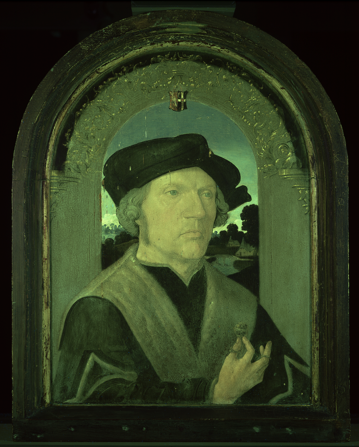
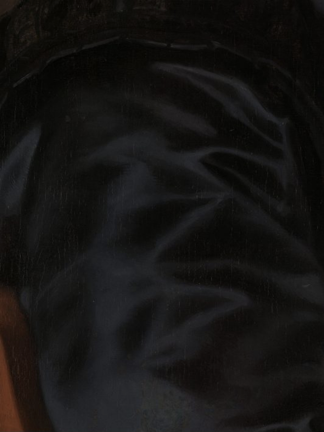
In the small portrait attributed to the studio of Jacob Cornelisz van Oostsanen and dated 1518 (oil on panel, 42.4 x 32.8 cm, Rijksmuseum, SK-A-3838; Figure 19), the sitter, Jan Gerritsz van Egmond van de Nijenburg (d. 1523), is portrayed wearing a black garment with fur collar and a black hat. Van Egmond was a magistrate and mayor of Alkmaar.[66] He holds a precious gold and silver prayer nut, which is not only an indication of his faith but also points at his wealth and prominence. The black garment and hat do not show any decorations or folds. However, in an ultraviolet (UV) image of the painting we see a simple fold construction of the hat and just a few folds in the sleeves near the cuffs [Figure 20]. There are no highlights or grey tones to create a sheen, hence the depicted fabric is probably a high-quality black wool.
In the Polarised Light Microscopy (PLM) image of a paint sample taken in the hat, the cross-section of the paint layer stratigraphy shows several layers used to create the deep black [Figures 21a–b]. The panel was prepared with a white ground consisting mainly of lead white with a little vermilion and some warm brown earth pigment particles. This preparation is followed by a first, oil-rich black layer, which seems to contain at least two black pigments. The first coarse and relatively translucent black pigment, which looks grey in the UV light, in PLM image is quite angular in its morphology. Scanning Electron Microscopy with Energy Dispersive X-ray (SEM-EDX) analysis indicated a high silicon presence, calcium, and trace elements of magnesium, aluminium, and potassium, and a trace of iron (Fe). This silicate-containing pigment is most likely a black chalk or black earth.[67] The other black, which also looks black in UV, is high in carbon and contains only traces of calcium, silicon, aluminium and potassium.
The black chalk or black earth could be the black chalk De Mayerne describes as a ‘black blue’ or a ‘blue black’. The other black could be a coal-type black, such as Smythe (i.e. ‘smith’) coal or forge coal, used by the blacksmiths, a bituminous coal very low in sulphur. [68] On top of this layer is what seems to be an unpigmented oil layer, highly fluorescent in UV, possibly used as an oiling-out layer to saturate the black before applying the last thin black layer.
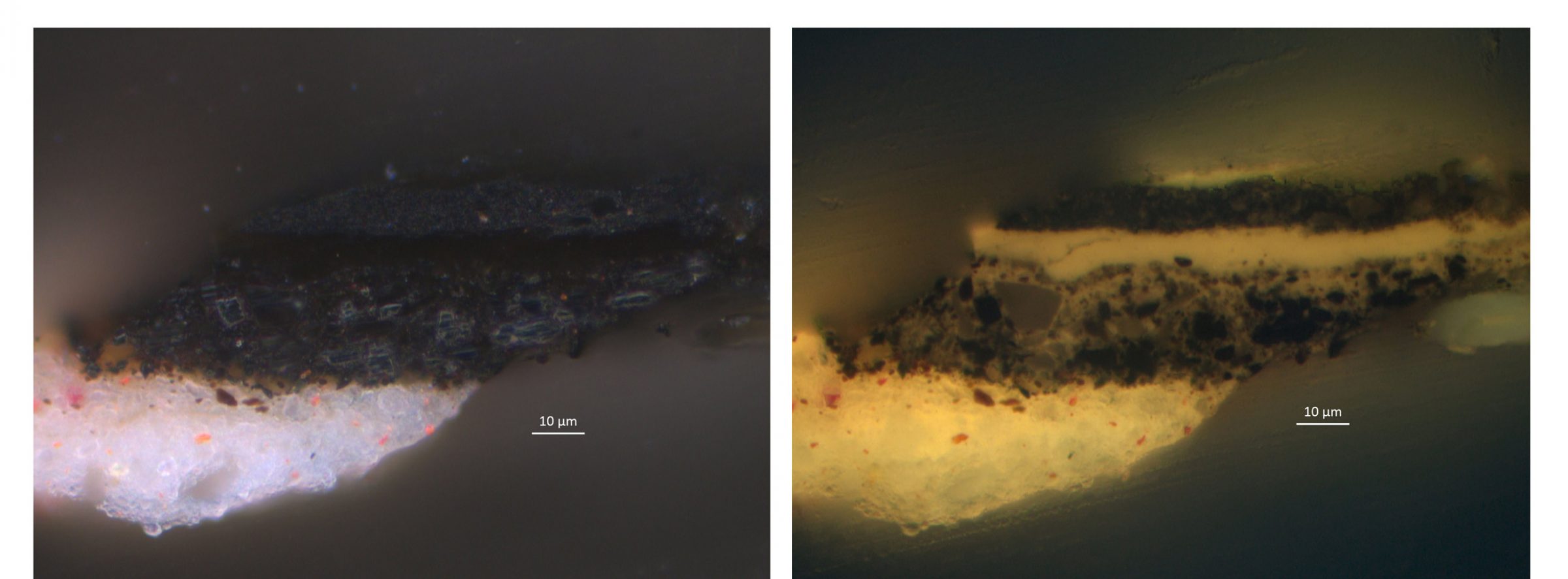
For this finishing layer, Van Oostsanen seemed to have used the same black pigments but ground much finer to create a deep transparent black to finish the hat and render it a black wool, as here too there is no heightening or highlights typical for velvet, silks, and satins. Indeed, the infrared image of the hat shows a uniform black layer without any variation in intensity of the black, and only some indications of the hat’s structure.[69] Interestingly only small peaks of calcium combined with phosphorus are indicated by SEM-EDX, indicating some addition of ivory black. There is also a low amount of lead present, which could derive from the addition of litharge, a lead monoxide, to the oil, to speed up drying. The ivory black was probably added to deepen the black hue.
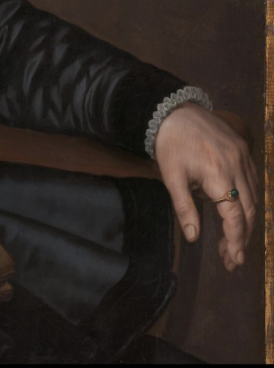
Another build-up can be found in the portrait by Anthonis Mor van Dashorst (Utrecht, 1519 – Antwerpen, 1575). Mor or Antonio Moro was for most of his career portraitist at the Spanish Habsburg court in Brussels. In 1554, Mor travelled to London and later to Spain as court portraitist of Philip II, but returned to Antwerp in 1561 where he mainly worked for wealthy mercantile clients. [70] The sitter, Sir Thomas Gresham (1519–1579), was the financial royal agent in Antwerp from 1551–1567, manager of the English court’s financial affairs in Europe, and founder of the Royal Exchange in London. As a mercantilist, supported by royal power, he protected the interests of English merchants, including the trade in raw wool and fabrics, and entered into a trade war with the Hanseatic League.

Gresham is dressed in what seems to be a silk satin garment with velvet decorations and a velvet hat (c. 1560–1565, oil on panel, 90 x 75.5 cm, Rijksmuseum, SK-A-3118; Figure 22). His portrait is a pendant to that of his wife Anne Fernely.[71] The quality of the garments in both portraits demonstrates the social status of the sitters, as does the painter, Anthonis Mor, a highly desired portrait painter at the European courts. Here he indeed excels in the depiction of the different black fabrics.
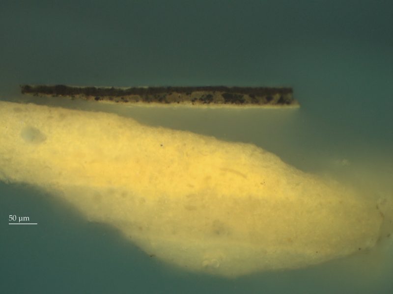
PLM images of a cross-section taken in a light area in the sleeve [Figure 23] show a simple paint stratigraphy of a chalk/glue ground, covered with an isolation layer of lead white in oil [Figures 24a–b] followed by a dark grey layer. Based on SEM-EDX results, we know that the dark grey paint contains a mixture of black, some lead white, a small amount of red lake (EDX shows a peak for aluminum, which derives from the hydrated alumina, used as the substrate for red lake), some blue particles, which are most likely indigo, and a few small brown particles, which could not be identified as iron oxides or earth pigments, but could be an organic black. There seem to be two types of black in this layer: small splintery particles and larger rounder particles. The first are high in carbon (C), while the latter have a high aluminum (Al), silicon (Si) and Calcium (Ca) and small amounts of potassium (K) and a little iron (Fe). This indicates most likely a black mineral such as black chalk or black earth as we saw in the van Oostzanen, while the splintery morphology of the smaller carbon rich black particles indicates a charred wood such as charcoal or vine black.[72] The addition of red lake and indigo, a recommendation made in some of the recipes as we have seen, would give the dark grey a cool, slightly purplish tone as can be seen in the painting, where it is used to create the beautiful sheen of what seems to be a satin material.
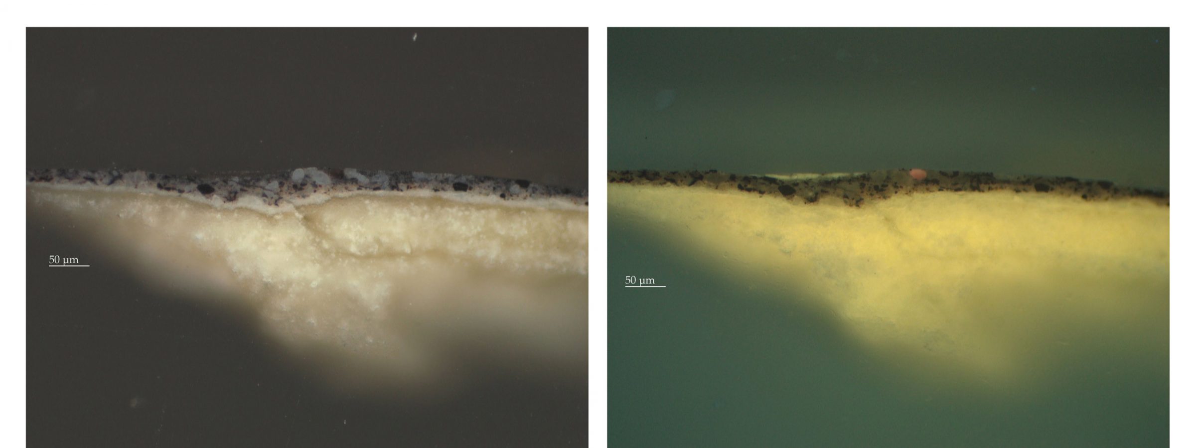
The cross-section taken in the decorative rim of Sir Thomas’s garments [Figure 25] shows the same build-up in the PLM images, but here an additional black layer was added to create the deep black of the decorative trim [Figure 26]. To render the difference between the satin and the deep black, matte fabric used in the trim, Mor omitted the lead white and added a very fine bone or ivory black to the mixture as indicated by the presence of calcium and phosphor (SEM-EDX), in the small black particles. Undoubtedly, this was also used in the black shadows in the satin. This build-up seems to correspond with what was recommended in the recipes for shadows and deep blacks where ivory black comes highly recommended as it is ‘blacker than black’.
Conclusions
Both dyers and painters knew how to obtain the great variety of blacks needed to dye as well as depict the many fabrics, yarns, embroidery, weaves, decorations and accessories worn by their clientele. These skilled artisans and artists used complex dyeing methods and clever pigment mixtures and paint layer build-ups for black silks, satins, velvets and wool, both in fabric and paint. Even though only few examples of actual black textiles survive, analysis of materials, structure and dyes provides a better understanding on how their colour was obtained, how this relates to historical recipes and, indeed, how it demonstrates the high level of skill of the dyers and weavers involved.

The authors greatly enjoyed the opportunity to collaborate on this project and share their expertise and will continue to do so in future projects. Working together has definitely led to a better understanding of the practical implications of painting a 3D structured textile, especially with variations in gloss and light absorption, as well as varying depths of shade and colour, in 2D. It also led to a greater appreciation of artisanal skill and of the complexity of methods in both disciplines to obtain specific effects within what seemed to be a rather limited range of black hues but proved to be rather extensive. Using ingenuity, in both textiles and paintings, the different characteristics of black silk, satin, velvet and wool, as well as patterns in embroidery and other black decorations, were rendered with the utmost effect. This research did certainly broaden our knowledge on the practice of dyeing and painting black. Further investigations on other extant black textiles as well as on how these were depicted in paintings, extending into the seventeenth century, will show how these techniques evolved.
Acknowledgements
The inspiration for this paper came from the workshop Burgundian Black Collaboratory (16–18 January 2019), organised by Jenny Boulboullé (ARTECHNE Project, University of Utrecht) and Claudy Jongstra (textile artist) in collaboration with Natalia Ortega Saez (University of Antwerp) and Art Proaño Gaibor (Cultural Heritage Agency of the Netherlands), in which both authors participated. We are grateful to Art Proaño Gaibor for dye analysis on the textile objects; to Sepha Wouda (Rijksmuseum) for sharing the cross-sections and her observations on the Van Oostsanen portrait, which she beautifully restored; to Arie Wallert who took the Mor cross-sections; and to Katrien Keune and Moorea Hall-Aquitania for SEM-EDX. We also thank the editors of this volume for their constructive comments.
Bibliography
Berger, E. Quellen für Maltechnik während der Renaissance und deren Folgezeit (XVI.–XVIII. Jahrhundert) in Italien, Spanien, den Niederlanden, Deutschland, Frankreich und England. Nebst dem de Mayerne Manuskript, zum 1. Mal herausgegeben, mit Übersetzung und Noten versehen, Beiträge zur Entwicklungsgeschichte der Maltechnik (Munich: Callwey, 1901).
BL MS Sloane 2052, British Library, London, c. 1620–1646.
https://www.bl.uk/manuscripts/FullDisplay.aspx?ref=Sloane_MS_2052
An open access transcription of MS 2052, based on Berger 1901 is online available at the ARTECHNE database. https://artechne.hum.uu.nl/node/94995.
BnF MS. Fr. 640, Bibliothèque nationale de France, Paris, late sixteenth century.
https://gallica.bnf.fr/ark:/12148/btv1b10500001g.r=fr.%20%20640?rk=150215
Boulboullé, J. “Drawn up by a Learned Physician from the Mouths of Artisans.” Netherlands Journal for History of Art, 68 no. 1 (2019), 204-249. https://doi.org/10.1163/22145966-06801008
Boulboullé, J., and M. Stols-Witlox, “Working (with) the Corps. The Body of Sands, Colors, and Varnishes in BnF Ms. Fr. 640.” [Forthcoming]
Broecke, L., Cennino Cennini’s Il Libro dell’Arte. (London: Archetype, 2015).
Burnham, Dorothy K., Warp & Weft, A Textile Terminology (Toronto: Royal Ontario Museum, 1980).
Buss, Chiara, Seta. Dizionario delle mezzetinte 1628–1939 Da Avinato a Zizzolino. 1628 Mostre de drappi forastieri che si trovano presso mercanti (Milaan: … 2013).
Camps, C. “Black for Varnish for Armor,” in Secrets of Craft and Nature in Renaissance France, ed. Pamela Smith, et. al. New York: Making and Knowing Project, 2020. https://edition640.makingandknowing.org/#/essays/ann_071_fa_18.
Colenbrander, S. Zolang de weefkunst bloeit. Zijdeweverijen in Amsterdam en Haarlem, 1585–1750 (Amsterdam: UvA, 2010). https://hdl.handle.net/11245/1.327027
Colenbrander, S. “Kaffa and Dutch Fashion,” in Riggisberger Berichte 19, Netherlandish Fashion in the Seventeenth Century, ed. J. Pietsch and A. Jolly (Riggisberg: Abegg Stiftung, 2012), 63–70.
Coppens, Marguerite. “The Trade and Production of Lace in the Southern Netherlands During the Seventeenth Century: New Data, in Particular on the Subject of Black Lace,” in Riggisberger Berichte 19, Netherlandish Fashion in the Seventeenth Century, ed. J. Pietsch and A. Jolly (Riggisberg: Abegg Stiftung, 2012), 71–79.
Davids, Karel. “Craft Secrecy in Europe in the Early Modern Period: A Comparative View,” Early Science and Medicine, 10, no. 3 (2005), 341–48. https://doi.org/10.1163/1573382054615398.
Eastlake, C.L. Materials for a history of oil painting (London: Longman, Brown, Green, and Longmans, 1847).
Fels, D.C. Lost secrets of Flemish painting. Including the first complete English translation of the De Mayerne Manuscript, B.M. Sloane 2052 (rev. ed.) (Floyd, VA: Alchemist Inc., 2004).
De Graaf, J.A. van. Het De Mayerne Manuscript als bron voor de schildertechniek van de Barok, British Museum Sloane 2052 (Mijdrecht: Verweij, 1958).
Hardie, M., ed. Edward Norgate and the Art of Limning. (Oxford: Clarendon Press, 1919).
Hofenk de Graaff, J. The Colourful Past. Origin, Chemistry and Identification of Natural Dyestuffs (Riggisberg: Abegg Stiftung, 2004).
Hofenk de Graaff, J. “Dyeing Black in Seventeenth-Century Holland,” in Conserving Textiles. Studies in Honour of Ágnes Timár-Balászy, ed. I. Éri (ICCROM: Rome 2009), 60–67. https://www.iccrom.org/sites/default/files/publications/2019-1/iccrom_ics07_conservingtextiles00_en.pdf
Hofenk de Graaff, J.H. Geschiedenis van de Textieltechniek, Lakennijverheid – Sitsen – Zijdeindustrie (Amsterdam: Centraal Laboratorium voor Onderzoek van Voorwerpen van Kunst en Wetenschap, 1992).
Kern, U. “The art of conservation I. Theodore de Mayerne, the King’s black paintings and seventeenth-century methods of restoring and conserving paintings,” The Burlington Magazine (October 2015), no. 157, 700–708.
Kirby, Jo, Susie Nash, and Joanna Louise Cannon, eds. Trade in Artists’ Materials: Markets and Commerce in Europe to 1700. London: Archetype, 2010.
Laar, M. van de, D. de Haan, O. Karuvit,s, A. Wallert, and M. Wolters. “From Wood to Canvas: Anthonis Mor, Portraits of Sir Thomas Gresham and Anne Fernely,” The Rijksmuseum Bulletin, 58 (2010), 247–264.
Luijten, Ger, et al., eds. Dawn of the Golden Age: Northern Netherlandish art 1580–1620, (Amsterdam/Zwolle: Rijksmuseum/Waanders, 1993).
Making and Knowing Project, Pamela H. Smith, Naomi Rosenkranz, Tianna Helena Uchacz, Tillmann Taape, Clément Godbarge, Sophie Pitman, Jenny Boulboullé, Joel Klein, Donna Bilak, Marc Smith, and Terry Catapano, eds. Secrets of Craft and Nature in Renaissance France. A Digital Critical Edition and English Translation of BnF Ms. Fr. 640 (New York: Making and Knowing Project, 2020), https://edition640.makingandknowing.org.
Mander, Karel van. Schilderboeck. Pascher van Wesbusch: Haarlem, (1604).
Merrifield, Mary, Original treatises dating from the XIIth to the XVIIIth centuries on the Art of Painting (London, John Murray, 1849).
Moreno Parada, María José, “A cap? A collar? A seventeenth century puzzle from the Rijksmuseum collection: A case study on object interpretation in textile conservation” (Master’s Thesis, University of Amsterdam, July 2019).
Mortier, B. M., “Features of Fashion in the Netherlands in the Seventeenth Century,” in Riggisberger Berichte 19, Netherlandish Fashion in the Seventeenth Century, ed. J. Pietsch and A. Jolly (Riggisberg: Abegg Stiftung, 2012), 17–40.
Mortier, B.M. du, “Zwart laken uit Holland – over ververs, gilden, export, status en geloof” and “Ode aan twee wambuizen uit het Rijksmuseum,” in Ode aan de Nederlandse mode, ed. M. Hohé (Zwolle: Waanders, 2015), 11–17 and 18–20.
Müller, J., Exile Memories and the Dutch Revolt: The Narrated Diaspora, 1550–1750 (London & Boston: Brill, 2016).
Muller, J.M., and J. Murrell, eds., Edward Norgate: Miniatura or the Art of Limning (New Haven & London: Paul Mellon Centre BA, 1997).
Nie, W.L.J. de. “De Ontwikkeling der Noord-Nederlandsche Textielververij van de veertiende tot de achttiende eeuw”, (Leiden: University of Leiden, 1937), 184–191.
Ortega Saez, N. Black Dyed wool in North Western Europe, 1680–1850. The Relationship Between Historical Recipes and the Current State of Preservation. (Antwerpen: Universiteit van Antwerpen, 2018).
Parmentier, C. “Le réseau au cœur de la méthodologie de Théodore de Mayerne,” CTHS – La France Savante (édition électronique), Actes des congrès nationaux des sociétés historiques et scientifiques, Paris 2017, https://cths.fr/ed/edition.php?id=7216, last accessed 23 May 2018.
Pitman, S., “Black Color for Dyeing,” in Secrets of Craft and Nature in Renaissance France, ed. Making and Knowing Project et al. (New York: Making and Knowing Project, 2020). https://edition640.makingandknowing.org/#/folios/59v/f/59v/tl.
Rinaldi, S. Theodor Turquet de Mayerne. Pittura, scultura e delle arti minori, 1620–1646, Ms. Sloane 2052 del British Museum di Londra (Anzio: DeRubeis, 1995).
Seiler-Baldinger, A. Textiles, A Classification of Techniques. (Washington: Smithsonian Institution Press, 1994).
Serrano, A. “The Red Road of the Iberian Expansion–Cochineal and the Global Dye Trade” (PhD Thesis, Lisbon/Amsterdam, 2016).
Spring, M., et al. “Black Earths: A study of unusual black and dark grey pigments used by Artists in the Sixteenth Century,” National Gallery Technical Bulletin, Vol. 24 (2003), 96–114.
Trevor-Roper, H. “De Mayerne and his manuscript,” in: Art and patronage in the Caroline Court. Essays in honour of Sir Oliver Millar, ed. O. Millar & D. Armine Howarth (Cambridge & New York 1993), 264–293.
Trevor-Roper, H. Europe’s physician. The various life of Sir Theodore de Mayerne (New Haven & London: Yale University Press, 2006).
Vasari, G. Vite de’ più eccellenti pittori scultori e architettori, 1550 e 1568, a cura di R. Bettarini e P. Barocchi (Firenze: Sansoni, 1987).
Versini, C., and M. Faidutti, eds. Le manuscrit de Turquet de Mayerne, (Lyon: Audun Imprimeurs 1974).
Watt, Melinda. “Renaissance Velvet Textiles,” in Heilbrunn Timeline of Art History (New York: The Metropolitan Museum of Art, 2000). Retrieved January 24, 2020 from
https://www.metmuseum.org/toah/hd/velv/hd_velv.htm.
Wardle, P. “Seventeenth-Century Black Silk Lace in the Rijksmuseum,” Bulletin Van Het Rijksmuseum, 33(4), (1985), 207–225. Retrieved January 24, 2020, from www.jstor.org/stable/40382294
Winter, John. “The Characterization of Pigments Based on Carbon,” Studies in Conservation 28, Nr. 2 (1983), 49–66.
https://doi.org/10.2307/1506050.
Woodall, J. Anthonis Mor: Art and Authority, Studies in Netherlandish Art and Cultural History (Zwolle: Waanders, 2006).
Wuestman, Gerdien. “Het familjie boeckje van Pieter Boudaen Courten (1594–1668): memoires van een geportretteerde,” Bulletin van het Rijksmuseum, vol. 53 (2005), 42–61.
[1] Hofenk de Graaff, “Dyeing Black in 17th-century Holland,” 313–323.
[2] Hofenk de Graaff, “Dyeing Black in 17th-century Holland,” 320. On historical dye technologies and the use of mordants, see also Natalia Ortega Saez elsewhere in this volume.
[3] All dye analysis, unless mentioned otherwise, was carried out using HPLC or HPLC-MS by Art Ness Proaño Gaibor, for which we are extremely thankful.
[4] See the essays in part III of this volume for a discussion of extant recipe literature on black dyeing.
[5] Karel, “Craft Secrecy,” 341–348.
[6] Du Mortier, “Costume & Fashion,” 40.
[7] Seiler-Baldinger, Textiles, A Classification of Techniques, 87.
[8] Wetting and beating the fabric opens the scales on the outside of the wool fibres, they become entangled, and a felted layer forms on the outside of the fabric, closing openings in the weave. Since wool is a water-repellent material this makes the fabric more water-resistant.
[9] Hofenk de Graaff, “Geschiedenis van de Textieltechniek,” 28.
[10] Hofenk de Graaff, The Colourful Past, 293.
[11] De Nie, “De Ontwikkeling der Noord-Nederlandsche Textielververij,” 184–191.
[12] See on reconstruction experiments of this overdyeing method, Ortega Saez, Black dyed wool in North Western Europe, ch. 5, and the essays by Natalia Ortega Saez, Jenny Boulboullé and Jo Kirby in this volume.
[13] Du Mortier, “Costume & Fashion,” 161.
[14] MS Ashmole 1494, today in the collections of the Bodleian Library, Oxford. Repeated reworkings of this recipe produced a beautiful black; see essays in Part III in this volume.
[15] Du Mortier, “Costume & Fashion,” 161.
[16] Du Mortier, “Costume & Fashion,” 160.
[17] Seiler-Baldinger, Textiles, A Classification of Techniques, 92.
[18] Colenbrander, Zolang de weefkunst bloeit, 308
[19] Seiler-Baldinger, Textiles, A Classification of Techniques, 92–93.
[20] On imported colorants see Jo Kirby’s essay in this volume. See on red insect dyes, Serrano, “The Red Road.”
[21] Rijksmuseum, Rotterdam Museum, Museum Het Prinsenhof Delft, and other collections.
[22] Burnham, Warp and Weft, a Textile Terminology, 163.
[23] Colenbrander, Zolang de weefkunst bloeit, 125.
[24] Blue dyebath with logwood, indigo or woad, followed by a mordant like copperas, blue vitriol or verdigris; see Ortega Saez, Black Dyed Wool in North Western Europe, 72.
[25] Ortega Saez, Black Dyed Wool in North Western Europe, 98. On diverse historical names for black dyed textiles, see also Natalia Ortega Saez’s essay in this volume.
[26] Analysis performed by A. Ness Proaño Gaibor showed the presence of ellegic acid, a degradation product of tannins from a plant source, possibly gallnuts or sumac; see Ortega Saez, Black Dyed Wool in North Western Europe, 316.
[27] Preliminary results of analysis carried out by A. Ness Proaño Gaibor, RCE in February 2020, using Ultra High Performance Liquid Chromatography-Mass Spectrometry.
[28] Salomon Mesdach, Hortensia del Prado, d. 1627, Rijksmuseum, Amsterdam, SK-A-910 shows a cap with black lace; Michiel van Miereveld. Hendrick Hooft, 1640. Rijksmuseum, Amsterdam, SK-A-1250; Michiel van Miereveld. Aegje Hasselaer, 1640, Rijksmuseum, Amsterdam, SK-A-1251; and Bartholomeus van der Helst. Geertruida den Dubbelde, 1668. Rijksmuseum, Amsterdam, SK-A-141
[29] Coppens, “The Trade and Production of Lace,” 73.
[30] Wardle, “Seventeenth-Century Black Silk Lace in the Rijksmuseum,” 207.
[31] Moreno Parada, “A cap? A collar?” 22; Buss, Seta. Dizionario delle mezzetinte,” 11–30.
[32] On black dye technologies using iron waste, see also Natalia Ortega Saez’s essay elsewhere in this volume.
[33] Müller, Exile Memories and the Dutch Revolt, 152.
[34] Luijten et al., Dawn of the Golden Age, cat. no. 154, 477.
[35] On the Boudaen Courten Family, see Wuestman, ‘Het familjie boeckje,” 42–61.
[36] Vasari, Vite de' più eccellenti pittori scultori e architettori, 94–95.
[37] For a further discussion of black pigment recipes in sources from c. 1400–1600, see the essay of Birgit Reissland and Jenny Boulboullé, and on availability and trade in pigments Northern Europe, see the essay by Jo Kirby, both in this volume.
[38] On audiences and uses of Norgate’s manuscript, see Muller and Murell, Edward Norgate: Miniatura, 12–20.
[39] Citations are taken from the edition by Hardie, Edward Norgate and the Art of Limning, with corresponding page numbers, here page 93. See also Muller & Murrell, Edward Norgate: Miniatura, 59. This latter edition is based on the manuscript in the collection of the Royal Society, London: MS 136 with additional annotations from other manuscripts. Spring et al., “Black Earths,” 99 and note 27, found several types of black coal pigments in Italian paintings. De Mayerne (Sloane MS 2052, fols. 4r, 122v, and 156v) mentions a black coal and a black coal from Scotland (le charbon de terre d’Escosse).
[40] On sea cole and other types of coal, see Spring et al., “Black Earths,” 99 and note 27.
[41] Mariani manuscript, Leiden University Library, Voss. Germ. Gall. 15, Della Miniatura di Valerio Mariani…., fols. 13r–13v. Hermens is preparing a translation and fully annotated edition of this manuscript.
[42] The manuscript is the focus of the Making and Knowing project at Columbia University, New York, led by Prof. Pamela H. Smith and was also presented at the exhibition on the Toulouse Renaissance in France in 2018. The digitized treatise, a transcription, an annotated English translation, and many accompanying essays are now online accessible; see: https://edition640.makingandknowing.org. All English translations are taken from this edition. For more information on the Making and Knowing Project, a collaborative research and pedagogical initiative that created the critical digital edition, see www.makingandknowing.org, The manuscript, now held by the Bibliothèque nationale de France, is written in an anonymous hand. See https://archivesetmanuscrits.bnf.fr/ark:/12148/cc508953. For more information on the anonymous author–practitioner, see the introductory essays at https://edition640.makingandknowing.org/#/essays, last accessed 28 April 2020.
[43] See the French transcription at https://edition640.makingandknowing.org/#/folios/58v/f/58v/tc, last accessed on 28 April 2020.
[44] Théodore Turquet de Mayerne, Sir Theodore de Mayerne, Pictoria, sculptoria et quae subalternarum artium, unpublished manuscript, 1620–1646. British Library Digitised Manuscripts, Sloane Ms. 2052, last accessed 25 April 2020, http://www.bl.uk/manuscripts/FullDisplay.aspx?ref=Sloane_MS_2052. The Artechne database features a full rough digital transcript: http://artechne.hum.uu.nl/node/94995. The “Mayerne manuscript” was first mentioned in Eastlake, Materials for a History of Oil Painting. Modern editions and translations: Berger, Quellen für Maltechnik; Versini and Faidutti, Le Manuscrit de Turquet de Mayerne; Van de Graaf, Het De Mayerne Manuscript; Rinaldi, Pittura, Scultura e Delle Arti Minori; Fels, Lost Secrets of Flemish Painting. On De Mayerne and the “Mayerne Manuscript” MS Sloane 2052, see e.g., Trevor-Roper, “De Mayerne and his Manuscript”; Trevor-Roper, Europe’s physician; Kern, “The Art of Conservation I: Theodore de Mayerne”; Parmentier, “Le réseau au cœur de la méthodologie de Théodore de Mayerne”; Boulboullé, “Drawn up by a Learned Physician from the Mouths of Artisans.” All French transcriptions cited in this essay are based on Berger’s edition and compared & corrected against the original folios by Jenny Boulboullé and Jurjen Munk. All English translations are by the authors.
[46] MS Sloane 2052, fol. 93r, see: http://www.bl.uk/manuscripts/Viewer.aspx?ref=sloane_ms_2052_f093r, last accessed 27 April 2020.
[47] MS Sloane 2052, fol. 93r, marginal note in red ink: “La corne de cerf/ bruslée, quand/ vous la broyés avec eau sur/ la pierre devient/ brune, comme/ une terre ou/ ocre. Laquelle/ si vous meslee/ avec huyle sur/ la palette, il/ se faict un noir comme jaget/ tresbeau, com-/me j’ay veu, q/ a besoing des/ additions ordi-/naires pour/ seicher. Ce q’l/ ne faict jamais/ de soymesme.” See http://www.bl.uk/manuscripts/Viewer.aspx?ref=sloane_ms_2052_f093r, last accessed 28 April 2020.
[48] MS Sloane 2052, fol. 97r: “Du noir./ Le bon & excellent noir se doibt faire d’une substan-/ ce osseuse blanche extrêmement compacte./ Voyés que feront les dents de cheual, de boeuf,/ de chien, de sanglier, de Rosart./ Les os petreux de veau & de cheual. Le tout/ bruslé en vaisseau exactement clos.” See http://www.bl.uk/manuscripts/Viewer.aspx?ref=sloane_ms_2052_f097r, last accessed 27 April 2020.
Cennino Cennini, Il Libro dell’Arte, Chap. 37 describes the preparation of various black pigments. See Broeke, Cennino Cennini.
Reconstruction experiments to make antler, sheep bone and other black pigments following instructions from the De Mayerne manuscript have been performed during the Burgundian Black ROOHTS summerschool in Antwerp, July 2019 and with master students Painting Conservation, University of Amsterdam, February 2020, see essays by Natalia Ortega Saez and Jenny Boulboullé & Birgit Reissland elsewhere in this volume.
[49] BnF Ms. Fr. 640, fol. 65r, see the French transcription at https://edition640.makingandknowing.org/#/folios/65r/f/65r/tc, last accessed on 28 April 2020.
[50] MS Sloane 2052, fol. 4r: “Peu de Couleurs sont necessaires à un peintre/ pour peindre à huile, & le meslange de ces peu/ faict & compose toutes les aultres./ blanc de plomb./ Noir. Terre noire ou Crayon noir. Black/ [c]halke qui facilement se seiche, est gras, &/ s’estend fort bien, & vault mieulx que le char-/bon commun dont on faict le Bleu noir ou Noir/ bleu, pour peindre Satin & semblables choses.” With a marginal note in red ink on the left: “ Noir de houïlle ou/ charbon de terre/ d’Escosse./ Noir de charbon/ de sarment de vigne/ est bleüastre.” Noir de houïlle ou/ charbon de terre/ d’Escosse./ Noir de charbon/ de sarment de vigne/ est bleüastre.” See: http://www.bl.uk/manuscripts/Viewer.aspx?ref=sloane_ms_2052_f004r, last accessed 27 April 2020. Noir de huïlle most likely refers to a black coal deriving from a carbonaceous sedimentary rock, described in Cotgraves’ A Dictionarie of the French and English Tongues as “a kind of Minerall, in the countrey of Liege, that makes verie good fires.”
[51] See https://edition640.makingandknowing.org/#/folios/59v/f/59v/tl
[52] MS Sloane 2052, fol. 92v: “Noir de Lampe s’il n’est bruslé devient Jaune & se/ guaste estant couché auec huile./ Estant bruslé & meslé auec blanc de plomb faict un/ beau gris bluastre quasj comme l’Indico.” See http://www.bl.uk/manuscripts/Viewer.aspx?ref=sloane_ms_2052_f092v, last accessed 28 April 2020.
[53] See for the second edition: Muller and Murrell, Edward Norgate: Miniatura, 59.
[54] Van Mander, Schilderboeck,1604: “Van Laken oft Draperinghe. Het thiende Capittel, 5 … hoe dat elck vouwen maeckt nae zijnen aerdt…”
[55] Van Mander, Schilderboeck, 1604, idem: “T’rouw Linwaedt maeckt, gelijck natte Papieren, Rouw linnen ployen. Viercantighe vouwen, met scherpe hoecken.”
[56] BnF Ms. Fr. 640, fol. 59v; see the French transcription at https://edition640.makingandknowing.org/#/folios/59v/f/59v/tl.
[57] BnF Ms. Fr. 640, fol. 63v; see the French transcription at https://edition640.makingandknowing.org/#/folios/59v/f/59v/tl, last accessed on 28 April 2020.
[58] Citations are taken from the edition by Hardie, Edward Norgate and the Art of Limning, 98. See also Muller and Murrell, Edward Norgate: Miniatura. This latter edition is based on the manuscript in the collection of the Royal Society, London: MS 136 with additional annotations from other manuscripts.
[59] Hardie, Edward Norgate and the Art of Limning, 104.
[60] Hardie, Edward Norgate and the Art of Limning, 35.
[61] Hardie, Edward Norgate and the Art of Limning, 16.
[62] MS Sloane 2052, fols. 88v–88r: see http://www.bl.uk/manuscripts/Viewer.aspx?ref=sloane_ms_2052_f088v. : “Drapperie noire. Noir de Lampe, peu d’umbre. Un peu de blanc. Enfoncés auec Noir d'yvoire. mesle auec Verdet. Rehaussés auec noir de lampe allié de blanc & d’un peu d’ombre. […] satin noir. Couchés premierement auec noir d'yuoire & un peu de noir de Lampe pour le rendre gras, sans oublier le verdet vt supra, apres rehaussés auec blanc & noir de lampe & tant soit peu d’umbre. Il fault avoir l’estoffe devant soy, & mesler les couleurs sur la palette avec le cousteau. Velours noir tout de noir d'yuoire allié de verdet rehaussés auec noir de Lamp, blanc de plomb, & ombre tant soit peu pour seicher.’’
[63] MS Sloane 2052, fol. 93r, see: http://www.bl.uk/manuscripts/Viewer.aspx?ref=sloane_ms_2052_f093r, last accessed 27 April 2020.
[64] Merrifield, Original treatises, vol. 2, 666, 35a.
[65] MS Sloane 2052, fol. 130r: “Schwartz in Schwartz malen oder zuschreiben./ Meister Lucas Cheufs[?], Mahler zu Wittem-/ berg, hat under andern auch diss lob/ gehabt, dass er den besten Sam[m]it soll/ gemalt haben, darumb daz er in schwarz/ noch schwarzer, und auch allerschwarzst/ hat mahlen können, dem Thue allso./ […]/Reibs/ under Leinöl, so würstu sehen/ daz schwerzer ist dan kein schwarz.” See http://www.bl.uk/manuscripts/Viewer.aspx?ref=sloane_ms_2052_f130r, last accessed 28 April 2020.
[66] See, for an entry and technical information of this work, https://www.rijksmuseum.nl/en/collection/SK-A-3838/catalogue-entry, accessed 10 May 2020.
[67] Spring et al., “Black Earths,” 96 and note 14.
[68] Although no sulphur was indicated by SEM-EDX, this may be due to the overlap in the EDX spectrum of de S Kα peak with the Pb Mα peak. When lead white is present, here most likely form an oil binder with added litarghe, this make identification of the presence of sulphur difficult.
[69] We should take into account that the structure was more visible but due to darkening of the oil this nuance was lost.
[70] On Mor, see Woodall, Anthonis Mor: Art and Authority.
[71]Van de Laar et al., “From Wood to Canvas: Anthonis Mor,” 247–264.
[72] See also Winter, “The Characterization of Pigments,” 57–62.